When analysing photographs you should use as many key words as possible. You do not need to write about everything included below as some aspects are not relevant.
Basic facts
What is the title of the photo?
Who took it?
When was it taken?
What are your first feelings about the photo? E.g. I like/dislike it because……
Why do you think the photographer made this image? E.g. to sell/to advertise something.
Visual elements make notes on:
Exposure- is the image too bright (overexposed) or too dark (underexposed)
Shapes – Is there any shapes or patterns visible e.g. the buildings are rectangular in shape.
Texture – How would the image feel if you were to touch it e.g. The photograph has a rough/smooth/silky texture to it.
Pattern – Can you see any patterns e.g. The colours on the man’s coat are repeating red white and green which stand out against the neutral background. This pattern is visually eye catching.
Colour – Is there a main colour in the image? E.g. the image has a blue tone which gives the photograph a cool feeling.
Depth of field – See simple guide to photography to understand this. - https://photographylife.com/what-is-aperture-in-photography
Shutter speed– See simple guide to photography to understand this.- https://photographylife.com/what-is-shutter-speed-in-photography
Lighting - how has the light in the photograph been created - is it a natural source (i.e. the Sun) or is it falsely lit in the studio, why has the photographer used this lighting - is it to create dramatic effect, to create romance/ intrigue/ mystery etc?
Context
Where was it taken? E.g. outside or in a studio/ daytime/nighttime
What else was going on at the time? (e.g. historical events, other photographer work, technical innovation,
Religious/cultural influence)
Your response
What do you like/don’t like about the photo and why?
Is the photo successful?
Further notes
Maybe consider the time span that this photo is effective for.
Is this photograph similar to the photographers other work? How does it compare?
An example of an analysed photo
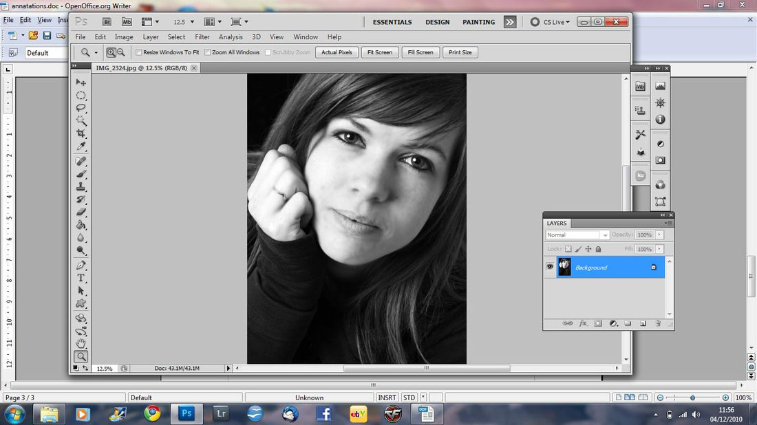
In this picture I really like how the top part of the girls head has been cropped so that her face and arm frame the picture. I also
like the lighting and how the light is very bright on the right side of her face and the arm but it’s just a bit darker on the left hand side which creates a bigger definition in the face.
The girl’s facial emotion fits in with the black and white effect really well because it looks very intense and serious. The black
and white effect also helps the picture stand out because it helps the lighting and the features more visible.
In photo-shop I increased the contrast a little bit so that the detail in the hair and face was more defined. I didn't want to increase
it to much because I like the grey and white colours against the black background and if I increased it to much the colours would be black and white. I also I duplicated the layer twice and changed the opacity to 20% on the third
layer, then I used the Gaussian blur on the second layer and put the opacity up
to 100% again on the third layer. Afterwards I used the eraser on the skin and because the second layer was still in Gaussian blur the skin became smooth and the eyes started to stand out more from the rest of the face. Then I flattened the image.
This picture is my favourite out of all the pictures in this project because I love how it’s an unusual angle but its still simple but
effective composition because the fact that she has her hands up against her on face and not much emotion on her face makes the picture look quiet and undisturbed.
